 Skip to content
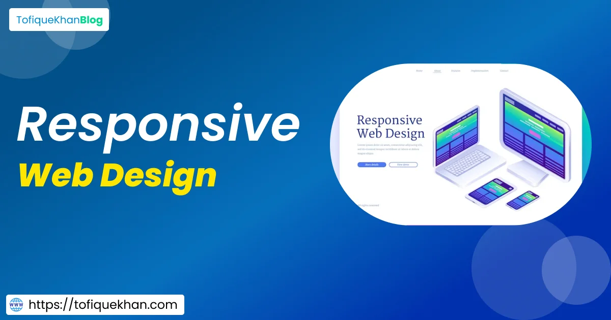
Discover the power of Responsive Web Design optimize layouts, prioritize content, and embrace trends for a seamless user experience.
Introduction:
In today’s digital landscape, where users access the web through a myriad of devices with varying screen sizes and resolutions, ensuring a seamless user experience is paramount. Responsive Web Design has emerged as the beacon guiding web developers and designers to create websites that adapt and flourish across all platforms. In this comprehensive guide, we’ll delve into the best practices and trends in Responsive Web Design to help you craft websites that not only captivate but also cater to the diverse needs of modern users.
Understanding Responsive Web Design:

Responsive Web Design (RWD) is more than just a buzzword; it’s a philosophy that revolves around creating websites capable of dynamically adjusting their layout and content based on the device accessing them. Gone are the days of designing separate websites for desktops, tablets, and smartphones. RWD enables a unified approach where a single website can seamlessly scale and optimize itself for any screen size, ensuring consistency and accessibility.
Best Practices for Responsive Web Design:
1. Mobile-First Approach:
Embrace the mobile-first approach, where the design process begins with optimizing for smaller screens. By prioritizing mobile users, you ensure that your website delivers a streamlined experience across all devices.
2. Fluid Grids and Flexible Layouts:
Utilize fluid grids and flexible layouts that adapt effortlessly to different screen sizes. Avoid fixed-width elements that may cause horizontal scrolling or visual clutter on smaller screens.
3. Media Queries:
Employ media queries to define breakpoints at which your layout should change to accommodate different screen sizes. Craft tailored CSS rules for each breakpoint to optimize the presentation of content.
4. Image Optimization:
Optimize images for various devices by using responsive images techniques such as srcset and sizes attributes. Serve appropriately sized images based on the device’s resolution to minimize load times and bandwidth usage.
5. Content Prioritization:
Prioritize content based on importance and relevance, ensuring that essential information remains accessible across all devices. Utilize progressive enhancement to deliver additional features to devices with larger screens while maintaining core functionality on smaller devices.
Trends in Responsive Web Design:

1. Dark Mode:
Dark mode has gained traction as a preferred interface option for many users, offering improved readability and reduced eye strain, especially in low-light environments. Implementing dark mode in your responsive design enhances user experience and adds a touch of modernity to your website.
2. Micro-Interactions:
Incorporate subtle micro-interactions to engage users and provide feedback in real-time. From animated buttons to interactive gestures, micro-interactions add depth and personality to your website, enhancing user engagement across all devices.
3. Minimalistic Design:
Embrace minimalistic design principles to create clean and clutter-free interfaces that resonate with modern aesthetics. Minimalism not only improves readability and navigation but also ensures that your website remains visually appealing across diverse devices and screen sizes.
4. Voice User Interface (VUI):
With the rise of voice-enabled devices and virtual assistants, integrating voice user interfaces into your responsive design can enhance accessibility and user engagement. Design intuitive voice commands and responses to create seamless interactions for users across all devices.
Responsive Web Design (RWD) has revolutionized the digital landscape, ensuring seamless user experiences across devices. Let’s explore advanced techniques and emerging trends to elevate your RWD game.
Advanced Techniques in Responsive Web Design:
1. Performance Optimization:
Implement lazy loading, code splitting, and other performance optimization techniques to ensure swift loading times across all devices.
2. Device Agnostic Design:
Design with device-agnostic principles, focusing on content hierarchy and functionality rather than specific device dimensions.
3. Progressive Web Apps (PWAs):
Enhance user engagement by transforming your website into a Progressive Web App, offering app-like experiences across various devices and platforms.
4. Accessibility Integration:
Prioritize accessibility by adhering to WCAG guidelines, ensuring that your RWD is inclusive and usable for all users, including those with disabilities.
5. User-Centric Personalization:
Utilize data-driven insights to personalize user experiences, delivering tailored content and features based on user behavior and preferences.
Emerging Trends in Responsive Web Design:
1. Augmented Reality (AR) Integration:
Explore AR integration to create immersive experiences that blur the lines between physical and digital worlds, enhancing engagement and interactivity.
2. Motion Design:
Embrace motion design principles to bring your RWD to life with fluid animations and transitions, captivating users and guiding them through your content.
3. 3D Graphics and Visuals:
Incorporate 3D graphics and visuals to add depth and realism to your RWD, creating memorable experiences that leave a lasting impression on users.
4. Blockchain Integration:
Explore blockchain integration to enhance security, transparency, and trust in your RWD, offering users peace of mind and safeguarding sensitive data.
Conclusion:
In the ever-evolving landscape of website design metters on Speed Optimization with, Responsive Web Design stands as a beacon of adaptability and accessibility, ensuring that websites remain functional and visually appealing across all devices. By embracing best practices such as the mobile-first approach, fluid layouts, and media queries, coupled with incorporating emerging trends like dark mode and micro-interactions, you can elevate user experience and stay ahead of the curve. Responsive Web Design isn’t just a design choice; it’s a commitment to inclusivity and user-centricity in the digital realm. So, let’s embark on this journey together, crafting websites that seamlessly adapt to the diverse needs of modern users, one responsive design at a time.


2 Responses
Профессионализм и инновации в автосервисе
Техцентр [url=https://tokyogarage.ru/]https://tokyogarage.ru/[/url].